Start a project
GitHubLinkedInXInstagramEmail

Wellness · Brand & Commerce · Case study

Vera

Made from things you can name. Warm and tactile. A palette taken from clay, sand and moss, a high-contrast serif given room to breathe, and easing slow enough to lower a heart rate.

Sector
Wellness · Brand & Commerce
Type
Self-initiated brand system
Studio
Greene Studios
Typeface
Fraunces Variable + Public Sans Variable
System
8px grid · 600ms motion
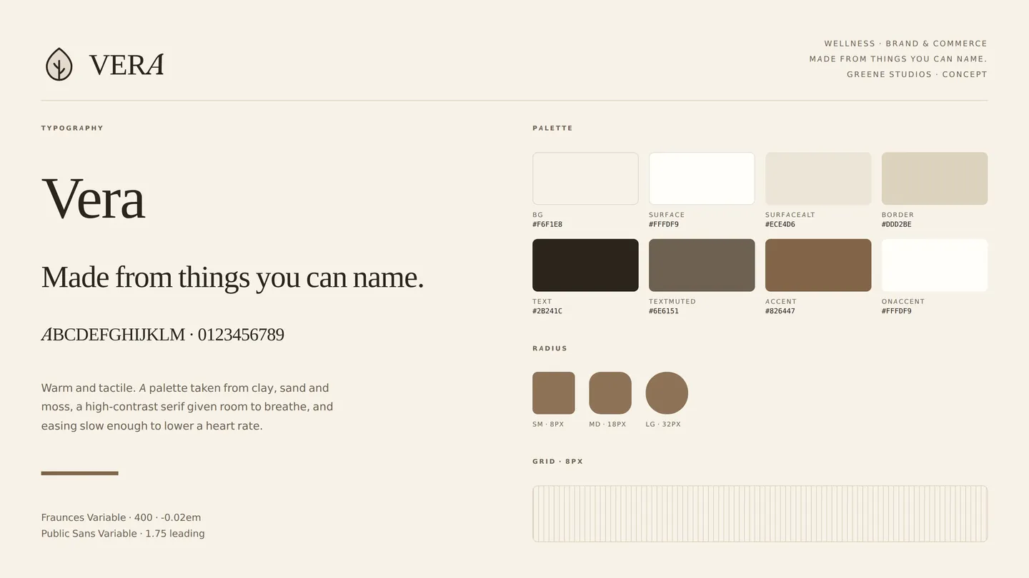
Vera identity sheet: logo, type and colour

01The brief

Wellness branding has converged on two looks: clinical white-and-blue, or a beige minimalism that says nothing at all. Vera was a test of whether a third option holds up, warm, tactile, specific, without sliding into the pseudo-scientific language the category is full of.
02Three decisions

A palette from materials, not moods

Clay, sand and moss, sampled rather than invented. The result is warmer than the category default and, more usefully, it makes the product photography sit inside the brand instead of on top of it.

One serif, given room

Fraunces at 400 rather than a heavier weight, with generous leading and a long measure. The restraint is the luxury signal; a bolder setting would have read as a supermarket own-brand.

600ms easing

Three times slower than Luminary. Nothing on Vera snaps. The motion is doing brand work rather than feedback work, and a wellness brand that moves briskly is arguing against itself.

03Palette & type

Background#f6f1e8
Surface#fffdf9
Surface alt#ece4d6
Border#ddd2be
Text#2b241c
Muted text#6e6151
Accent#826447

Fraunces Variable + Public Sans Variable. A 8px grid and 600ms motion.

04Voice

  • Plain nouns. If an ingredient has a common name, use it.
  • Never claims a health outcome. Describes what is in the jar.
  • Sentences run long and settle. No urgency, no countdowns.

05The build

Centred compositions throughout, the opposite of Luminary's left-aligned grid, because a shop should feel arranged rather than laid out. Product imagery is generated from the brand's own tokens, so the range looks like a range without a single photograph.

06In use

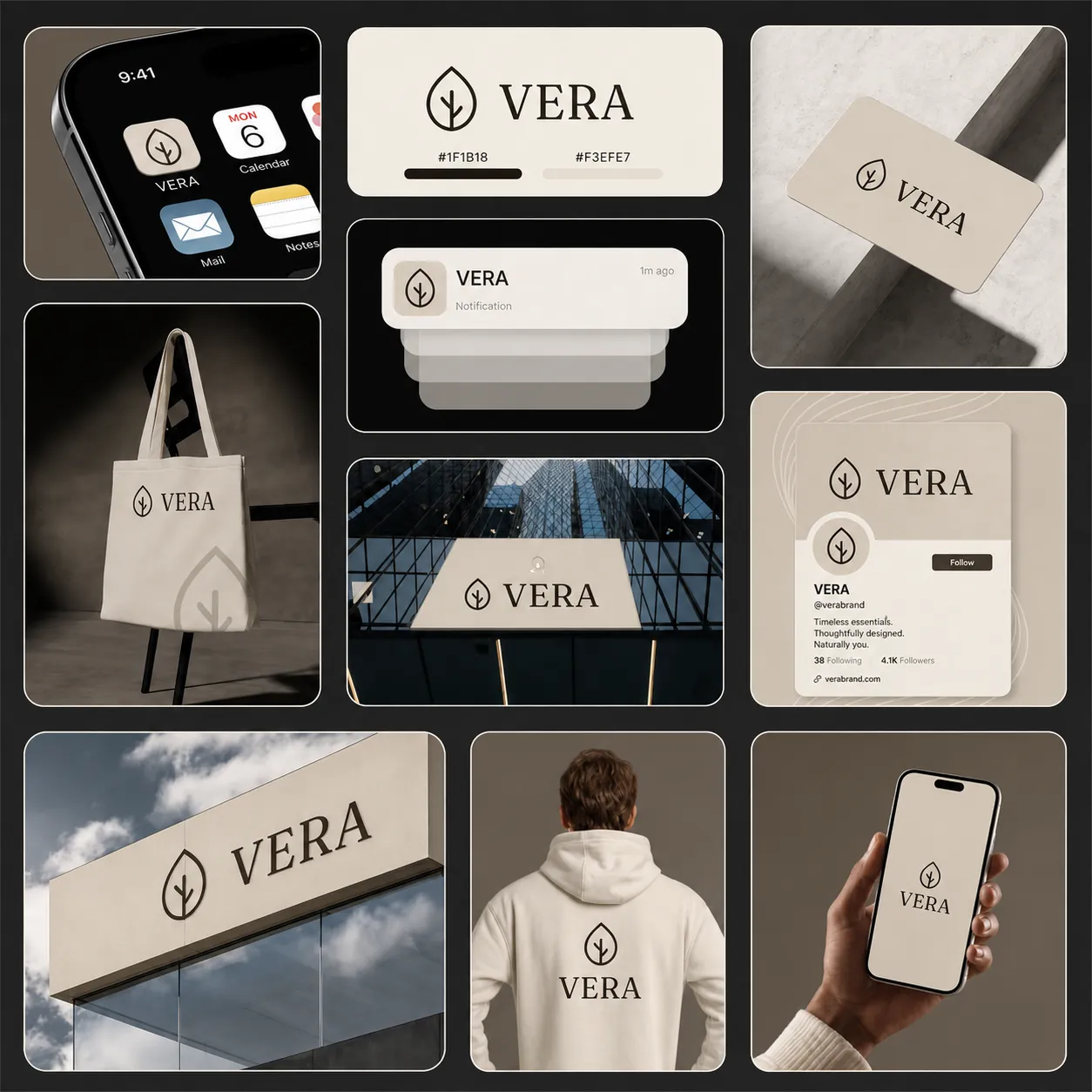
Vera brand applications

07What I learned

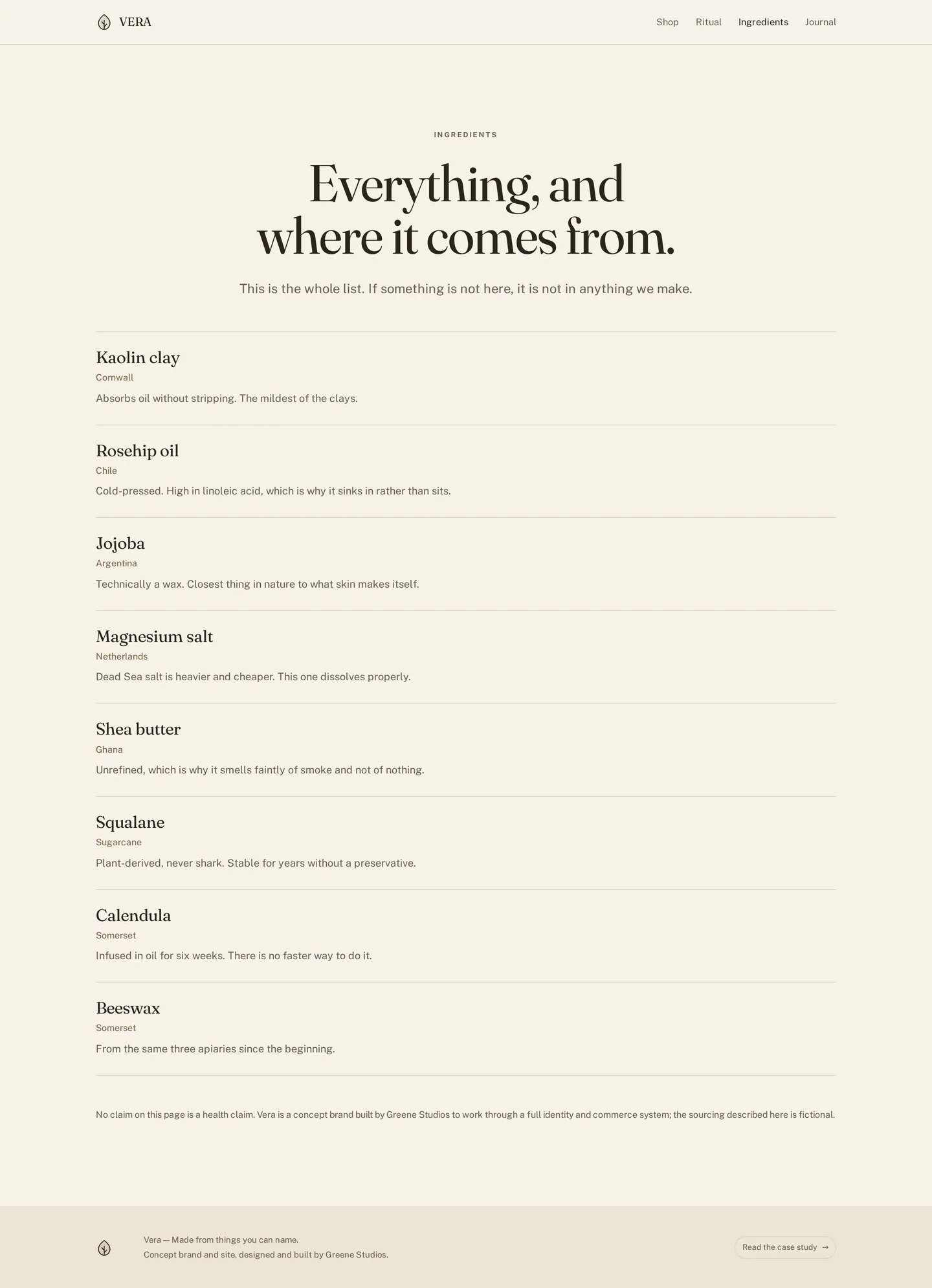
Writing the ingredients page first fixed the rest of the voice. Once the constraint was 'name the thing, say where it is from, say why', the marketing copy had nowhere to hide, and it got much better.

Screens

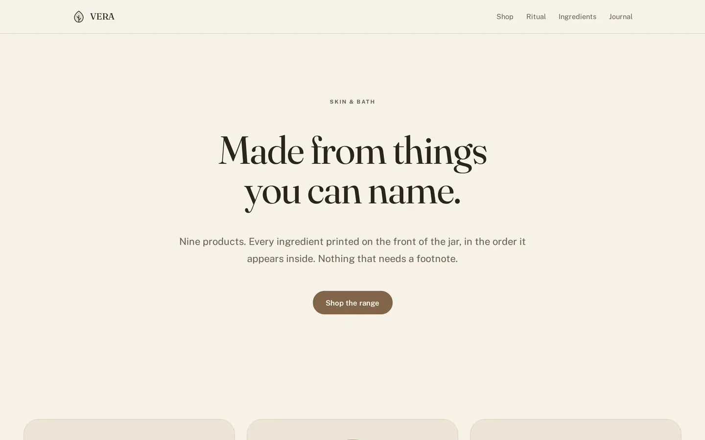
Home, desktop
Home, desktop01
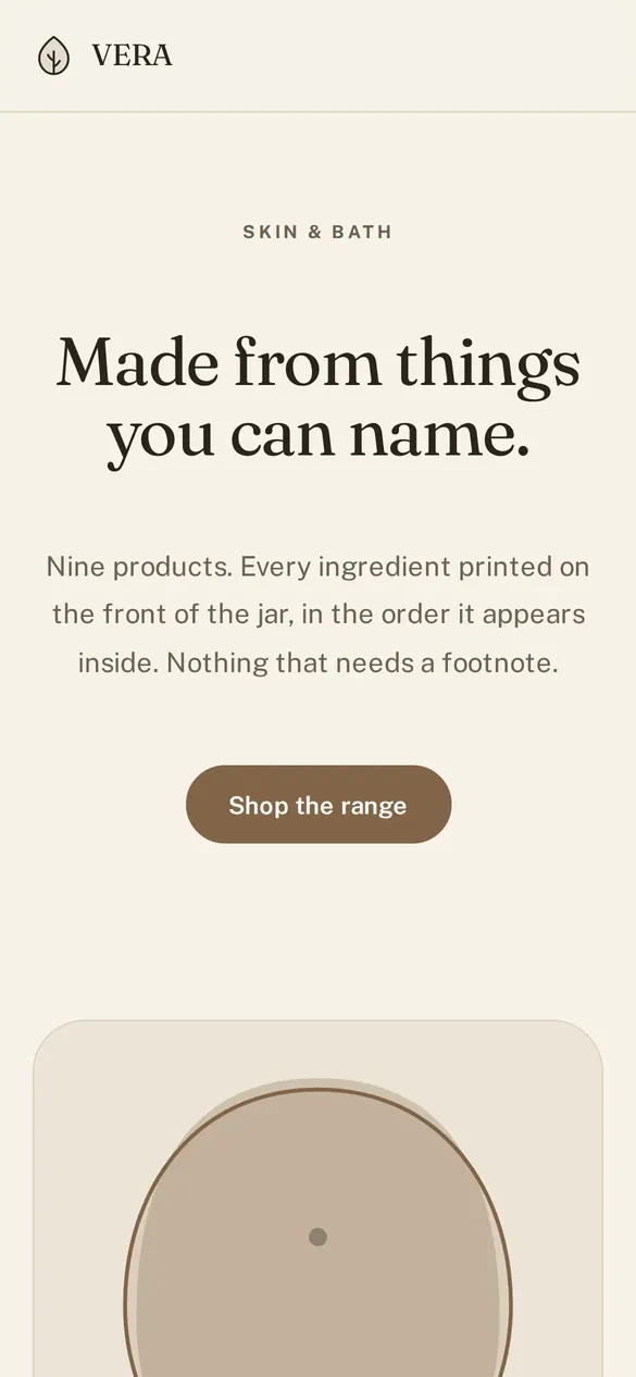
Home, mobile
Home, mobile02
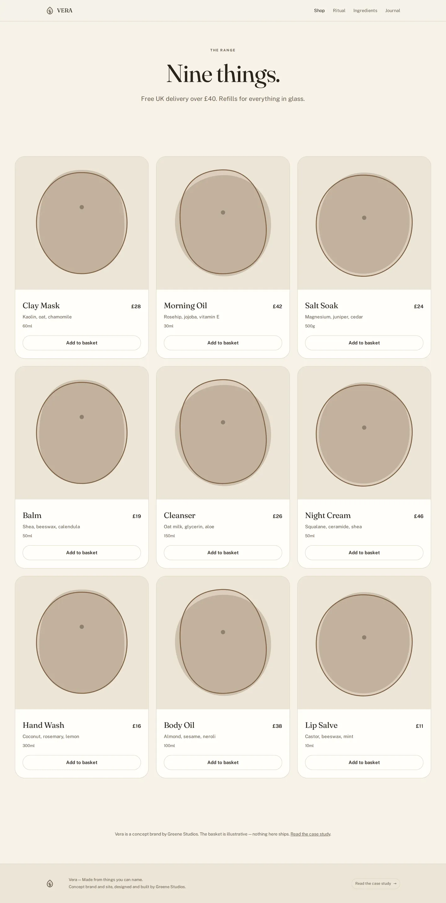
Shop
Shop03
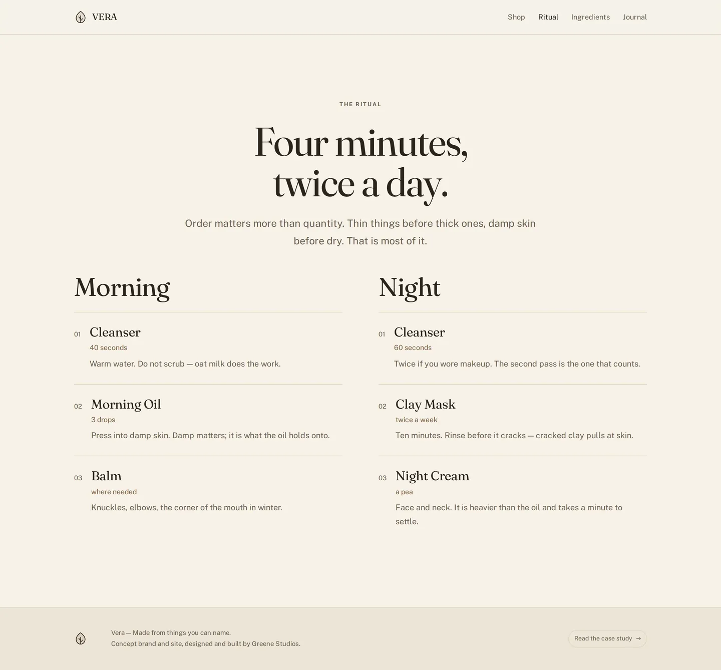
Ritual
Ritual04
Ingredients
Ingredients05
Journal
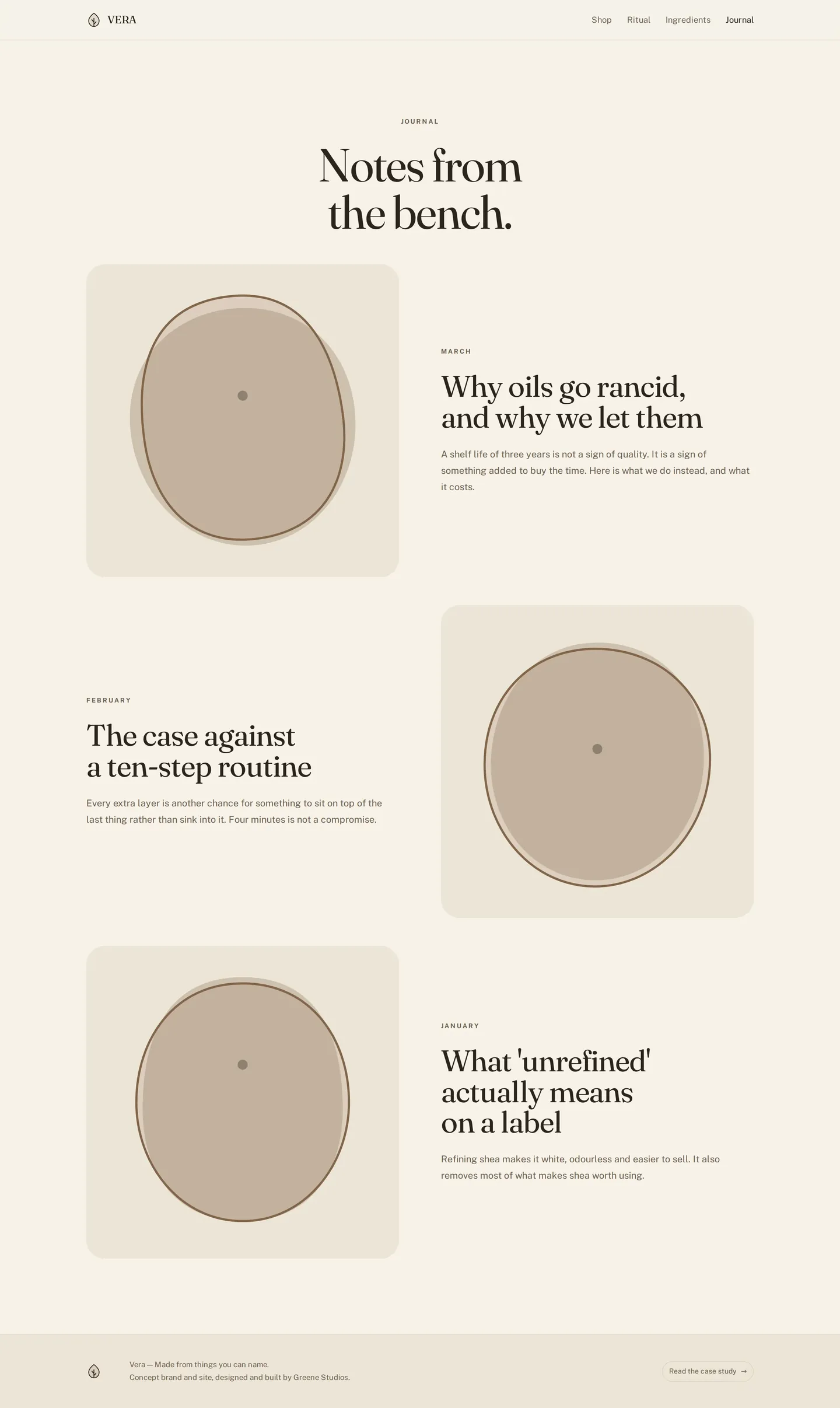
Journal06

Want a system like Vera?

I design brand systems that hold up from the logo to the last screen.

Start a project