Start a project
GitHubLinkedInXInstagramEmail

SaaS · Analytics · Case study

Luminary

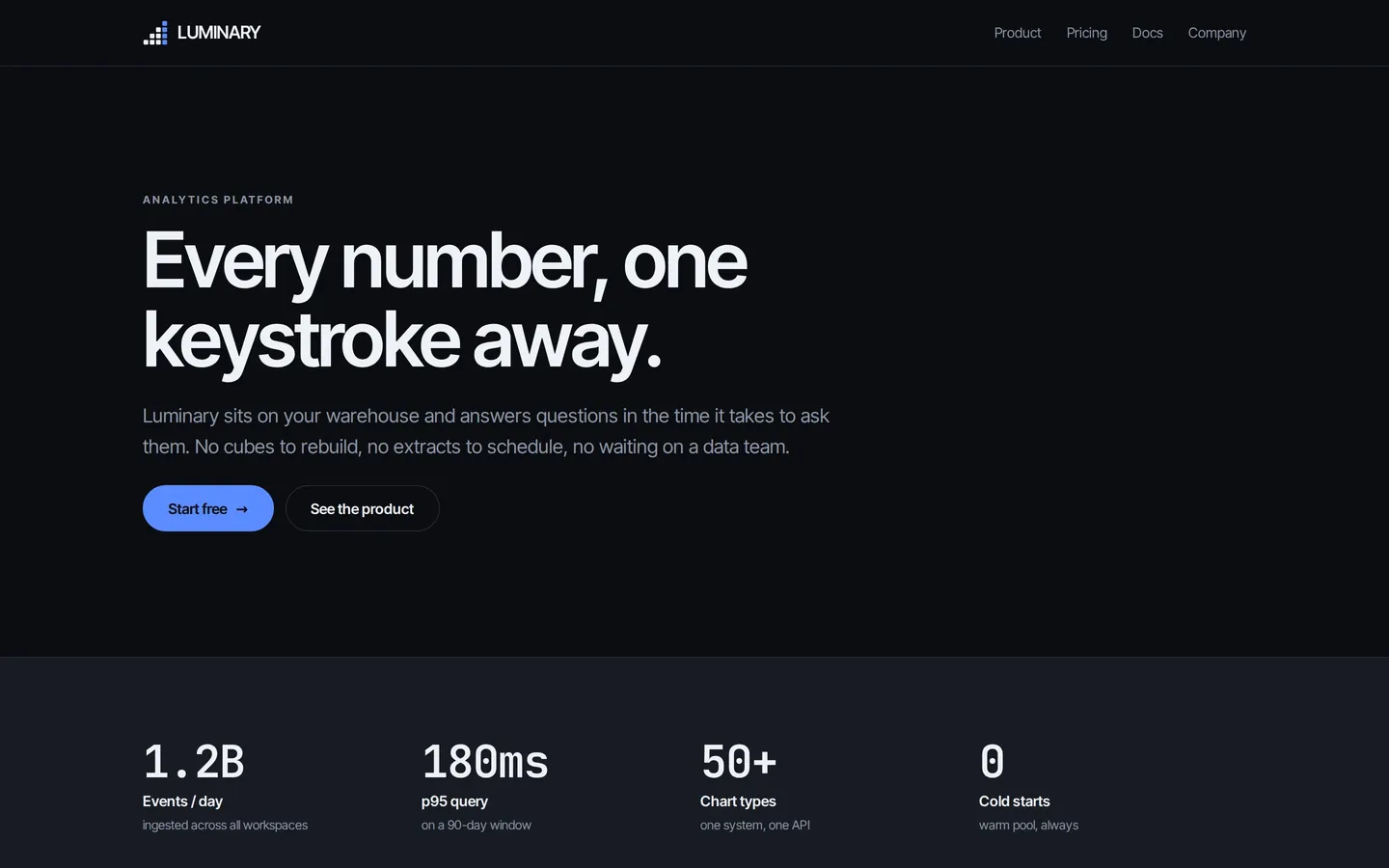
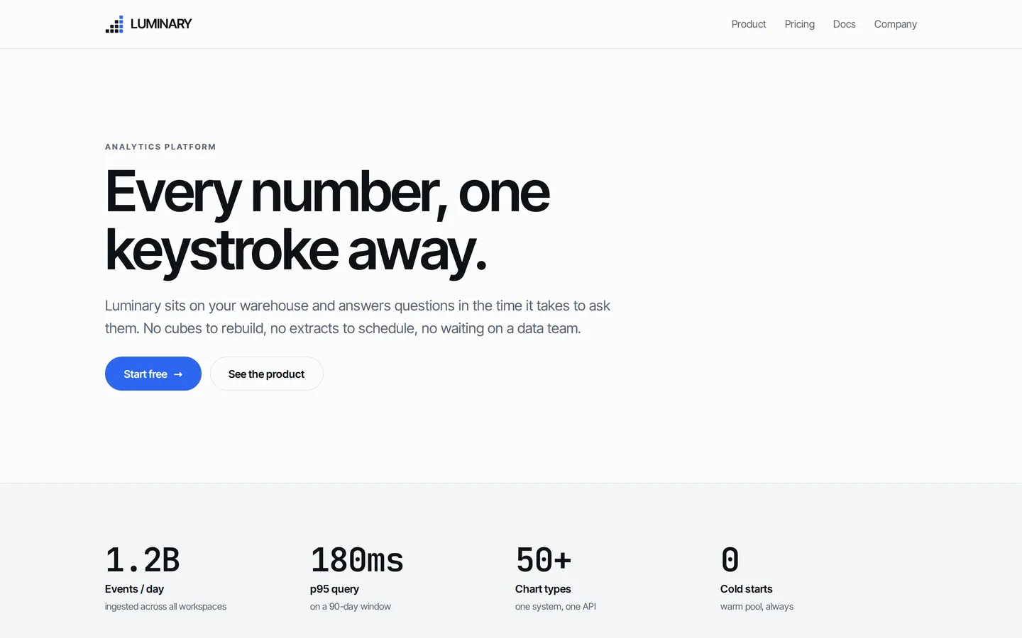
Every number, one keystroke away. A precision instrument. Neutral graphite so the data is the only thing with colour, tabular figures throughout, and a 4px grid that never breaks.

Sector
SaaS · Analytics
Type
Self-initiated brand system
Studio
Greene Studios
Typeface
Inter Tight Variable
System
4px grid · 180ms motion
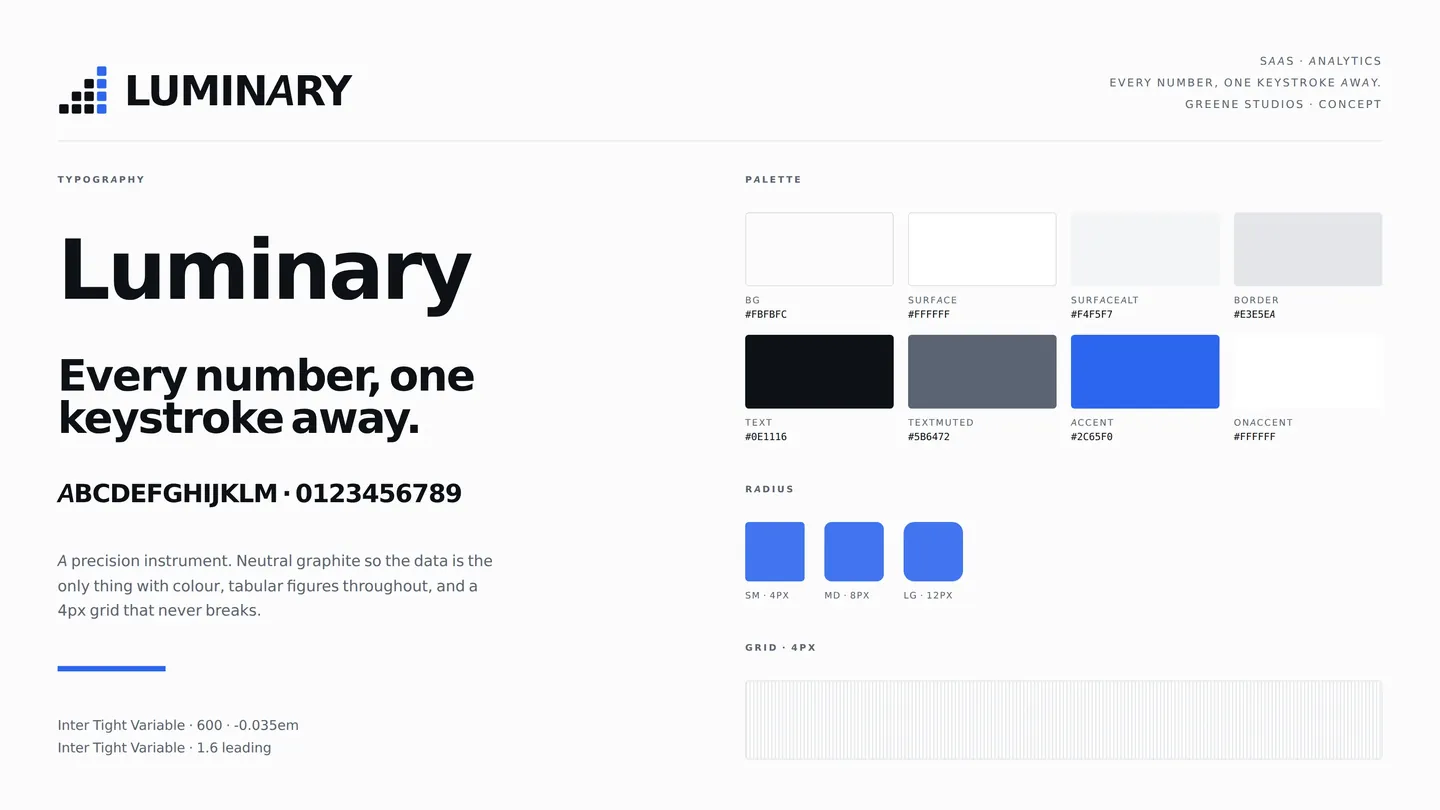
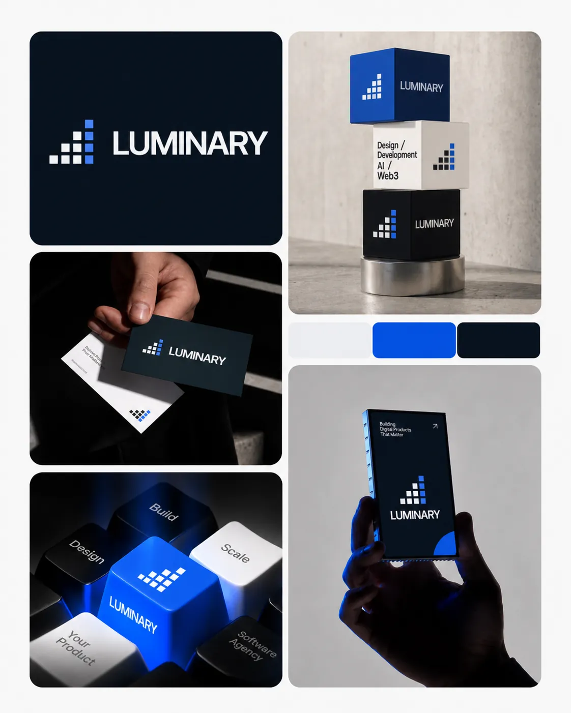
Luminary identity sheet: logo, type and colour

01The brief

Analytics tools are built to demo well to an executive and then used all day by an analyst. Those are different jobs, and the second one loses. Luminary was an attempt to design for the person who has the tool open for eight hours rather than eight minutes.
02Three decisions

Neutral graphite, one accent

If the interface has colour, the data cannot. Everything structural is graphite; the single electric blue is reserved for the live value and the primary action. On a dashboard, colour has to mean something.

Tabular figures everywhere

Proportional numerals make columns of numbers wobble, and a wobbling column is harder to scan. Every figure in the system is tabular, which is also why the type pairing includes a mono.

Nothing longer than 180ms

Motion that reads as elegant on a marketing page reads as lag in a tool you use all day. The whole system moves in 180ms on a near-linear curve, and the only thing that animates is state.

03Palette & type

Background#fbfbfc
Surface#ffffff
Surface alt#f4f5f7
Border#e3e5ea
Text#0e1116
Muted text#5b6472
Accent#2c65f0

Inter Tight Variable. A 4px grid and 180ms motion.

04Voice

  • Declarative. States what the product does, never how it feels.
  • Numbers in the copy wherever a number is the honest answer.
  • No exclamation marks. No 'powerful'. No 'seamless'.

05The build

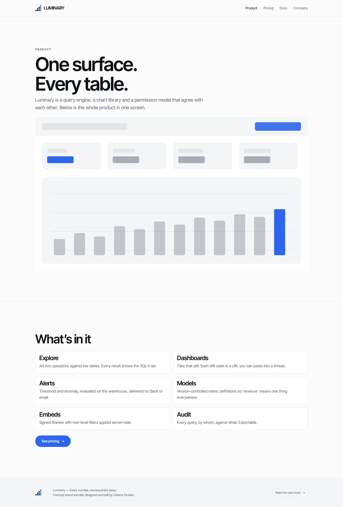
A 4px grid, four radius steps, and a type scale with one family doing display and body. The product page renders its interface as a diagram rather than a fake screenshot, this is a concept, and a mocked-up screenshot pretending to be software would be the wrong kind of persuasive.

06In use

Luminary brand applications

07What I learned

Committing to a 4px grid made most layout decisions disappear. When every spacing value is a multiple of four, there is no argument about whether something should be 18 or 20, it is 16 or 20, and one of them is obviously right.

Screens

Home, desktop
Home, desktop01
Home, dark mode
Home, dark mode02
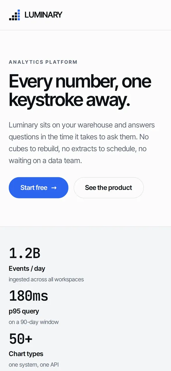
Home, mobile
Home, mobile03
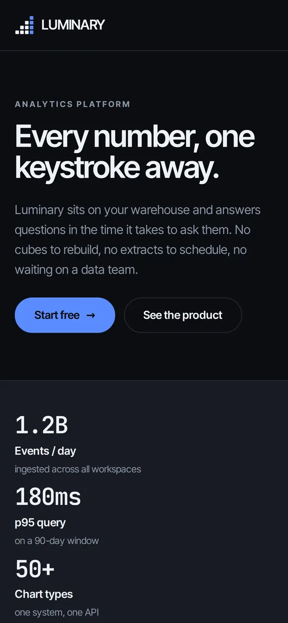
Home, mobile dark
Home, mobile dark04
Product
Product05
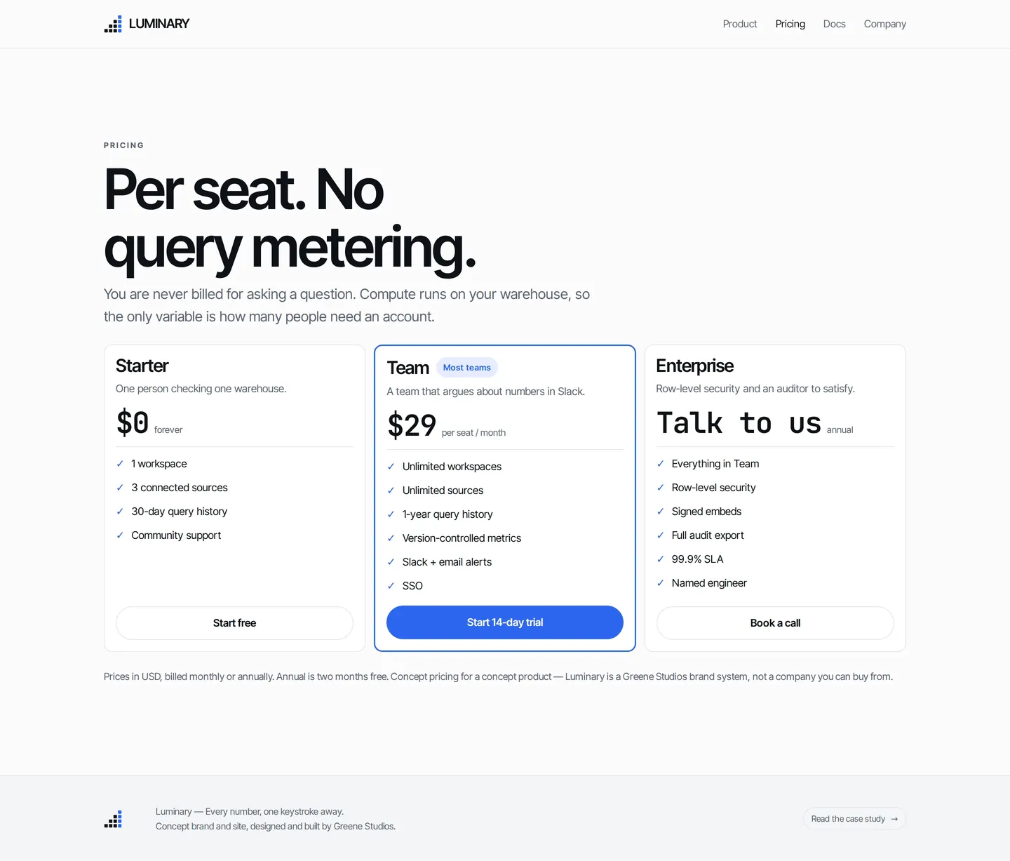
Pricing
Pricing06
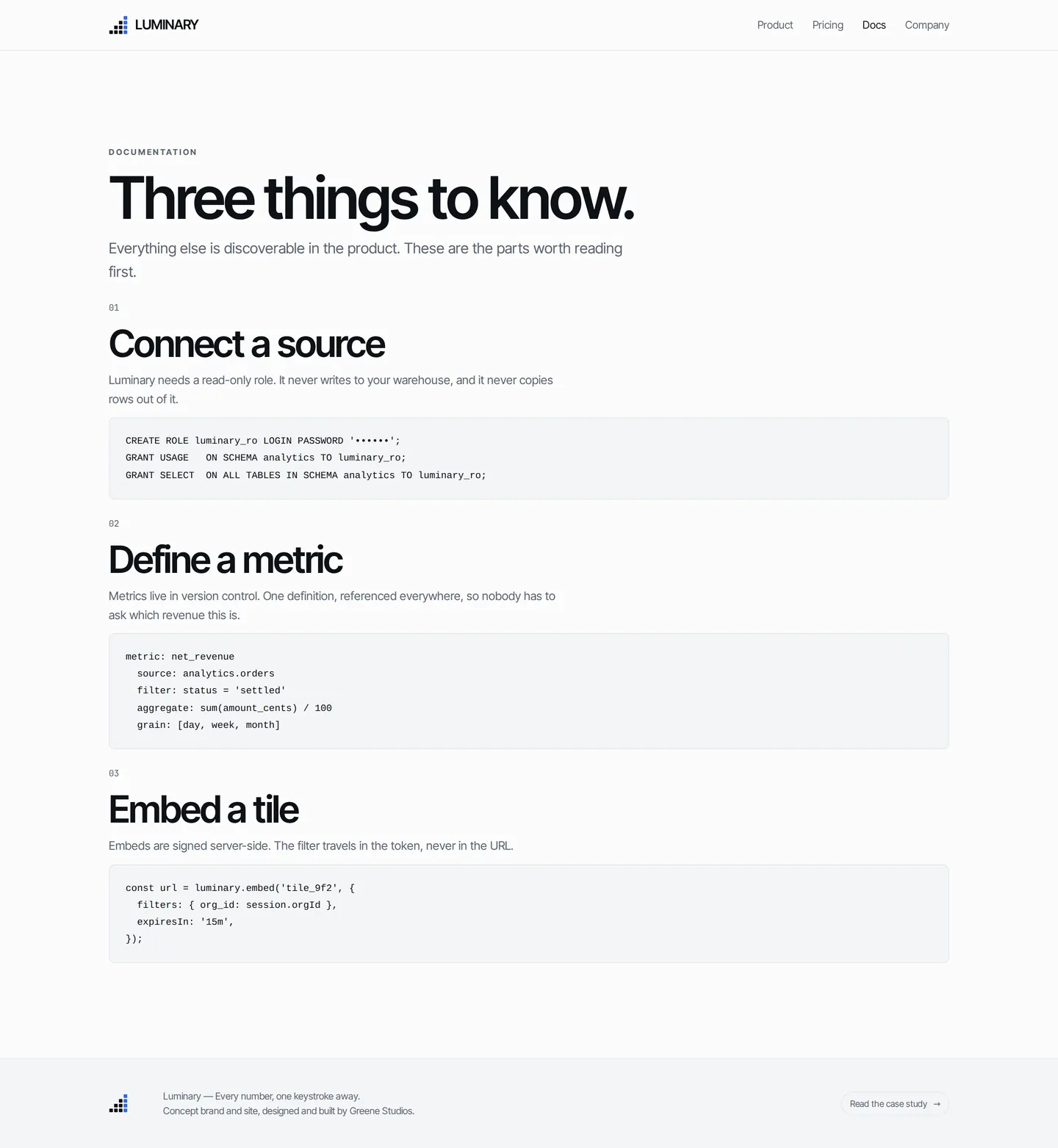
Docs
Docs07
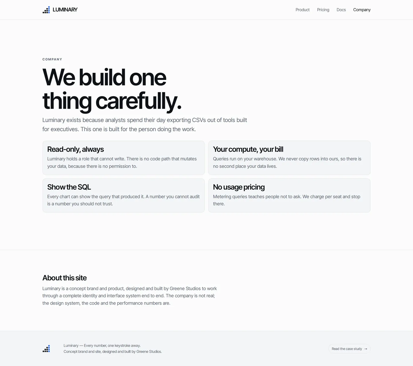
Company
Company08

Want a system like Luminary?

I design brand systems that hold up from the logo to the last screen.

Start a project