Start a project
GitHubLinkedInXInstagramEmail

Healthcare · Product · Case study

Bloom

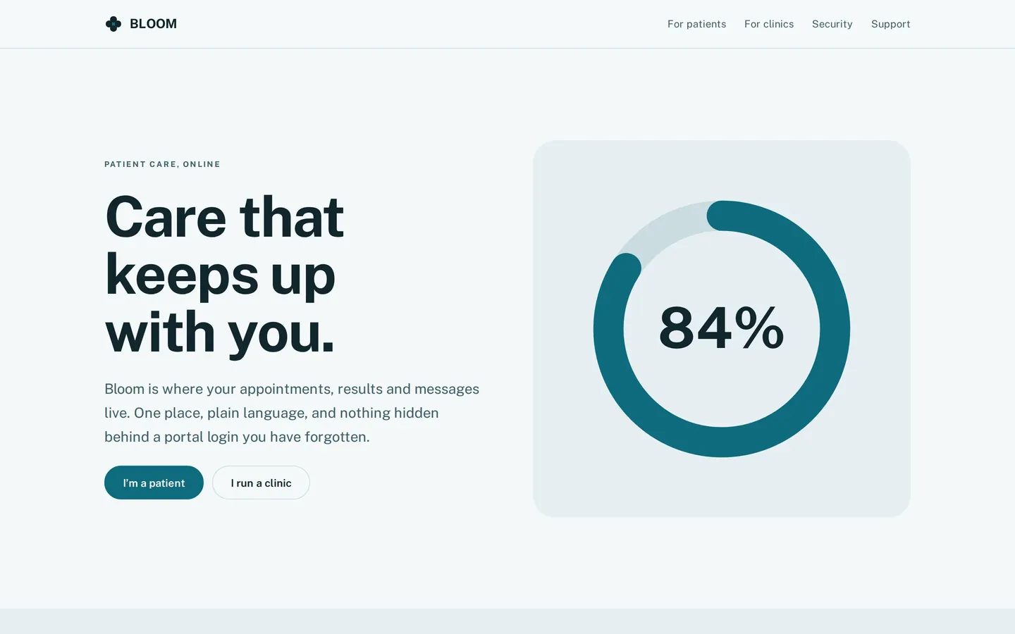
Care that keeps up with you. Calm and legible. AAA contrast on body text, an 18px base, 48px touch targets, and colour that never carries meaning on its own.

Sector
Healthcare · Product
Type
Self-initiated brand system
Studio
Greene Studios
Typeface
Public Sans Variable
System
8px grid · 220ms motion
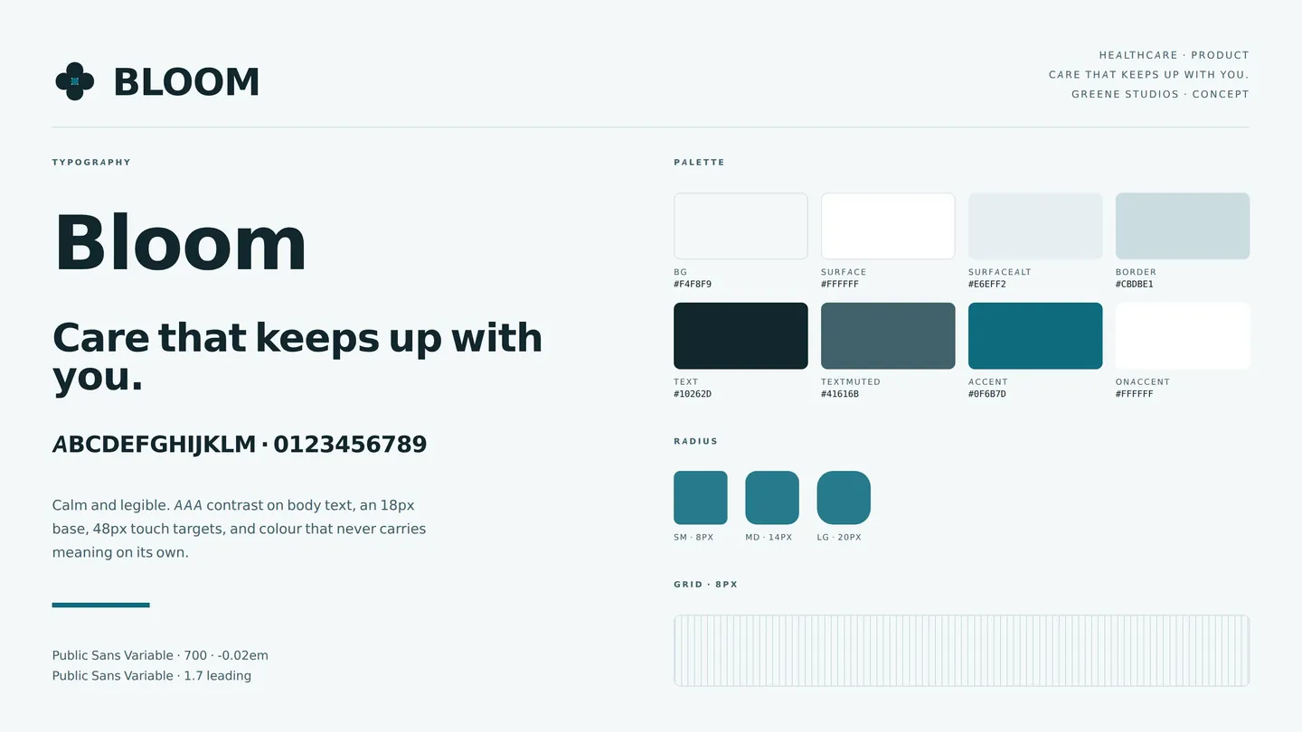
Bloom identity sheet: logo, type and colour

01The brief

People open healthcare software on their worst day, on an old phone, in a corridor with one bar of signal. Bloom was built to see how much of a design system falls out of taking that seriously as the primary case rather than the edge case.
02Three decisions

AAA body contrast, not AA

The higher bar changed the palette rather than the other way round. Several colours that looked right had to go, which is the point, accessibility as a constraint you design inside, not a check you run at the end.

18px base, 48px targets

Two pixels of body copy and a larger tap target do not sound like brand decisions. On this product they are the brand decision, and every other spacing value follows from them.

Colour never carries meaning alone

Status is a word and a shape as well as a colour, throughout. It also means the system survives being printed, screenshotted, or read by someone who does not see the accent.

03Palette & type

Background#f4f8f9
Surface#ffffff
Surface alt#e6eff2
Border#cbdbe1
Text#10262d
Muted text#41616b
Accent#0f6b7d

Public Sans Variable. A 8px grid and 220ms motion.

04Voice

  • Second person, present tense. 'You have an appointment', not 'appointment scheduled'.
  • No medical claims, no jargon a patient would have to look up.
  • Every error says what happened and what to do next.

05The build

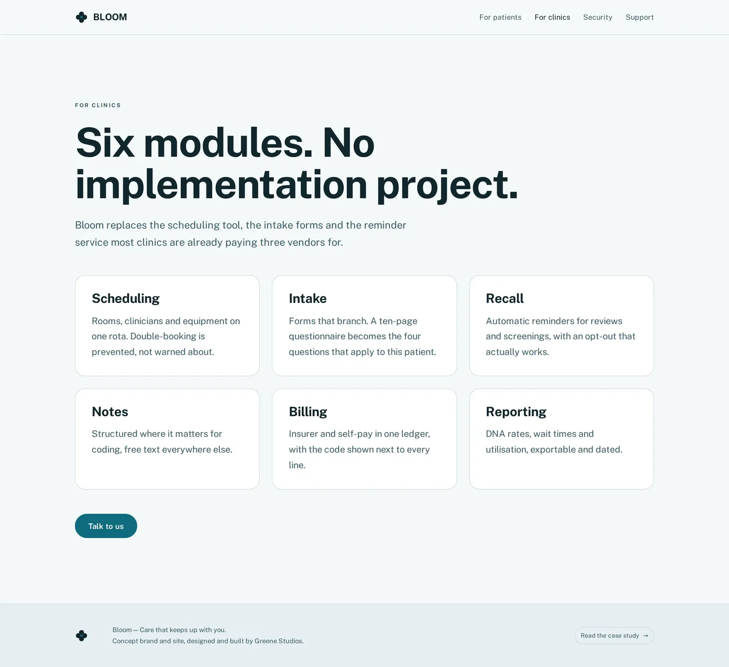
The calmest layout of the six: wide measure, generous vertical rhythm, and motion capped at 220ms. Numbered steps use a filled circle rather than a hairline outline because outlined numerals fail at small sizes for exactly the readers this product is for.

06In use

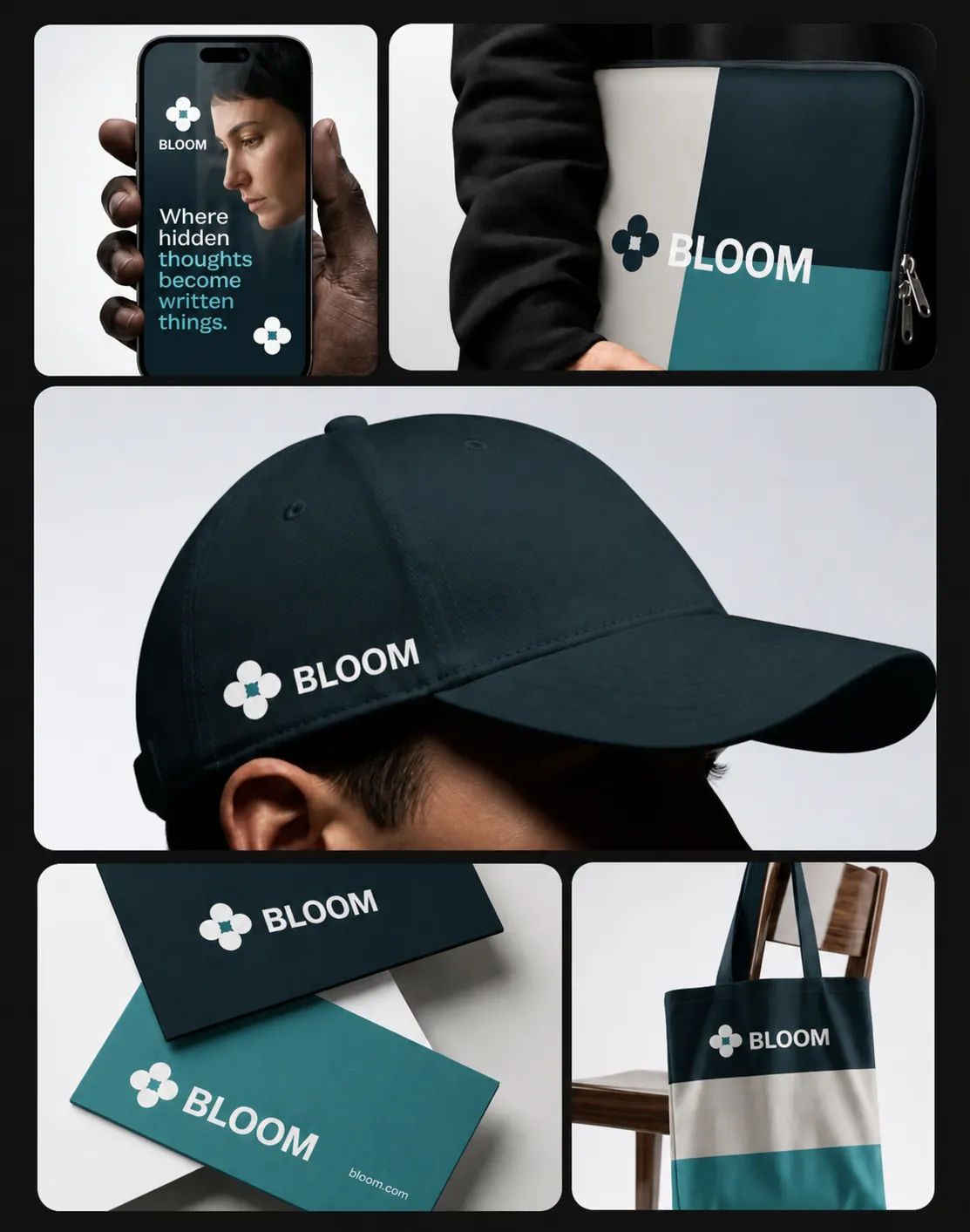
Bloom brand applications

07What I learned

Designing to AAA made the whole thing look better, not worse. The constraint removed the low-contrast greys that every interface reaches for by default, and nothing was lost.

Screens

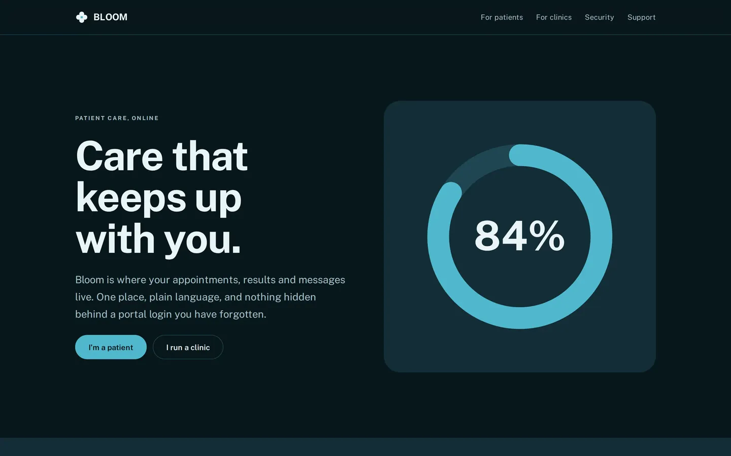
Home, desktop
Home, desktop01
Home, dark mode
Home, dark mode02
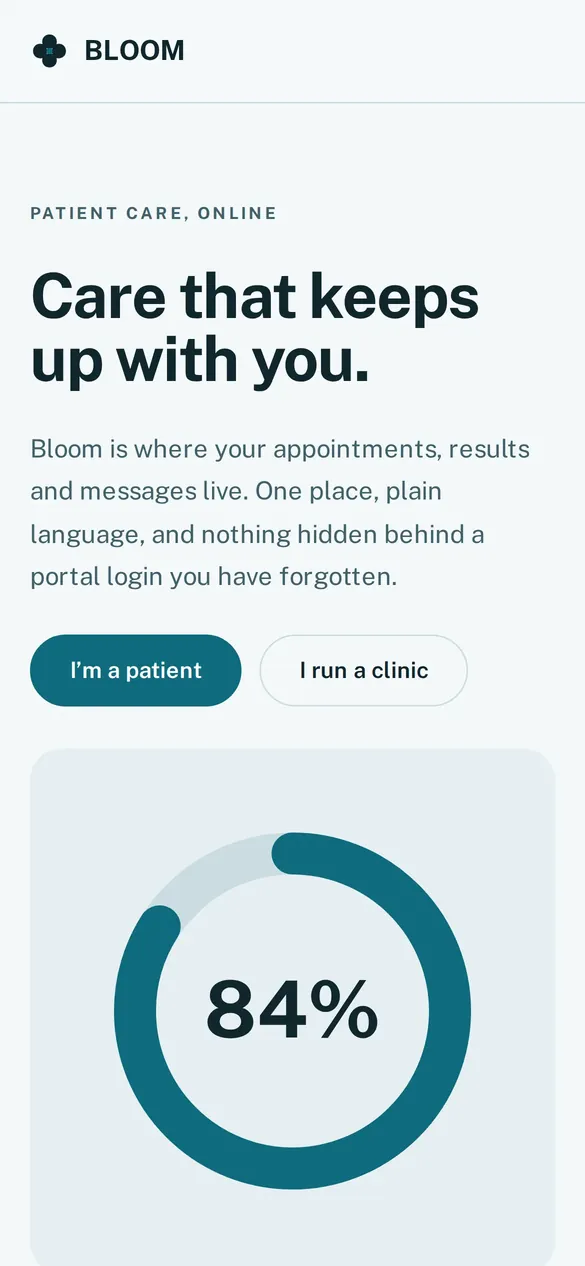
Home, mobile
Home, mobile03
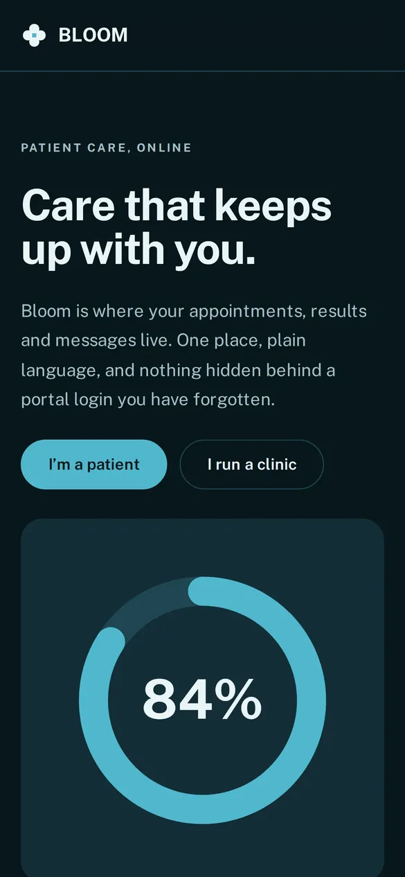
Home, mobile dark
Home, mobile dark04
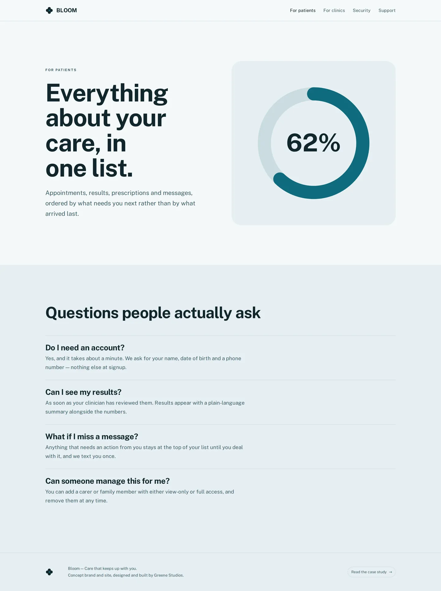
Patients
Patients05
Clinics
Clinics06
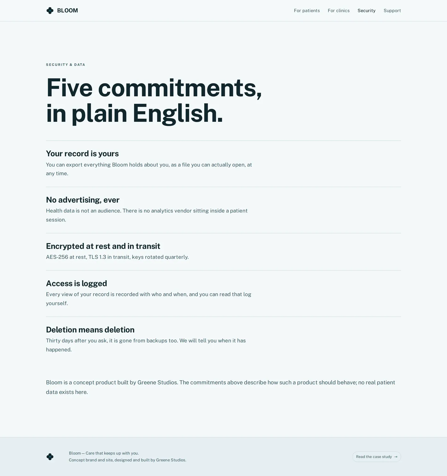
Security
Security07
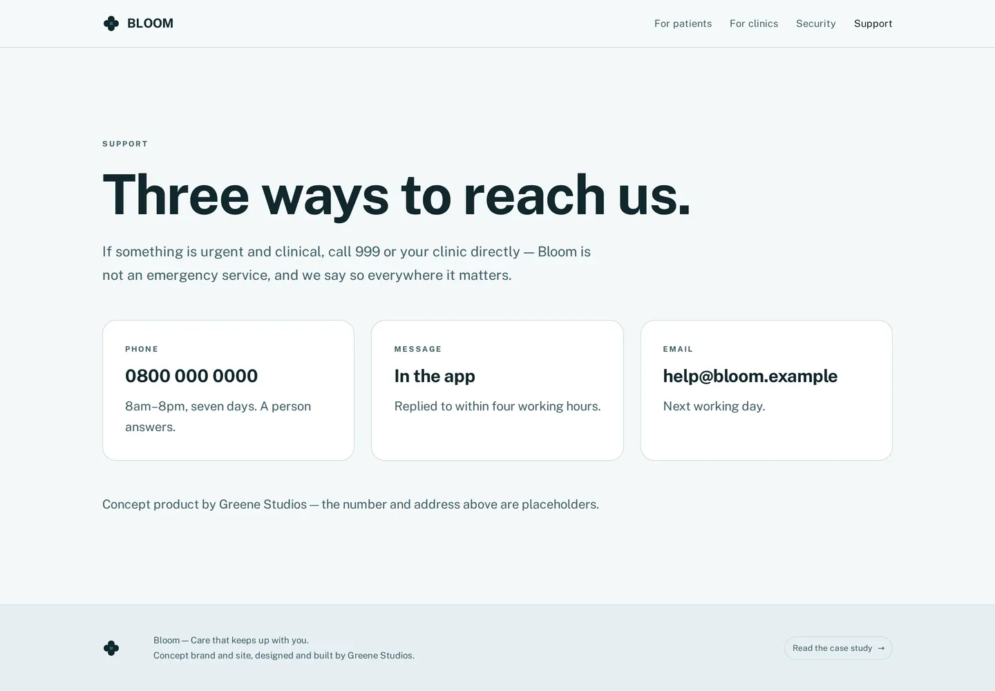
Support
Support08

Want a system like Bloom?

I design brand systems that hold up from the logo to the last screen.

Start a project